
2023-06-02, J. Köppern (and GPT-4)
In today’s fast-paced business world, data-driven decisions are more critical than ever. As a data scientist, I’ve experienced firsthand the power of leveraging data to solve complex problems and drive success for my company. However, I also understand that not everyone shares my technical background, making it challenging for non-experts to access and utilize the insights that data science has to offer. This realization led me on a journey with a end-to-end data science project that simplifies complex data analysis for non-experts, bridging the gap between technical experts and decision-makers in a company.
Throughout my career, I’ve been fortunate to work on a variety of projects that have made a tangible impact on the organizations I’ve been a part of. One such project, which I’ll discuss in this post, was particularly transformative for my company. To maintain discretion, I won’t reveal specific details, but I’ll present a similar problem to demonstrate how I used data science to develop an end-to-end solution that was accessible to non-data scientists.
In this post, I’ll share my thought process, the challenges I faced, and the lessons I learned while developing this data science web app. My goal is to show you that even as a technical expert, I can effectively communicate my ideas and solutions to a non-technical audience, like C-level executives, and help them harness the power of data science to make better-informed decisions. So, let’s embark on this journey together and explore the fascinating world of data science and its real-world applications.
The task at hand
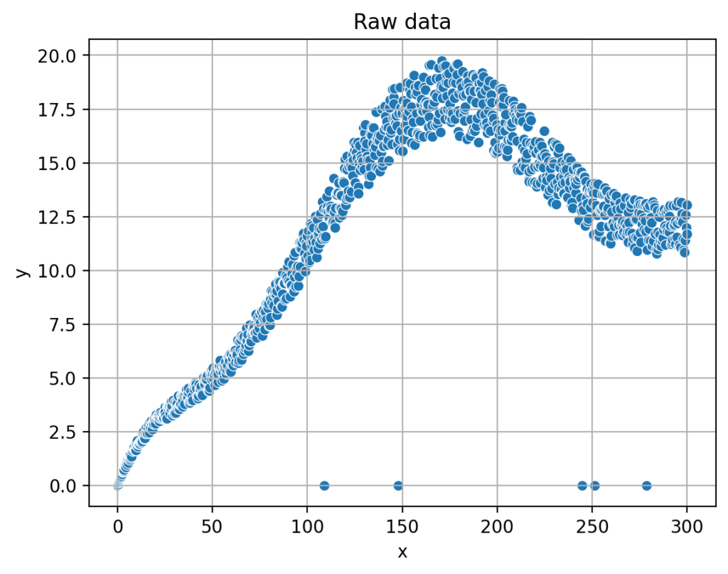
The (lab) device under consideration works similarly to an inkjet printer. Depending on how much force is applied to the ink, a drop of ink of different size is ejected. The relationship between said force, shown below on the X-axis in the diagram, and the size of the ink drops, as shown on the Y-axis, is to be determined. For this purpose, a large number of measurements are carried out, at which different forces are applied to the ink, and then the volume of the emitted drops is determined. And since these are real measurements, there is noise in the data and the results look like the following figure:
Now, the relationship between said force and the drop volume is to be described by a mathmatical function. Because If this is known, the device can calculate the force required to deliver a desired drop volume. And the users demand can be fulfilled.
The program should have a graphical user interface that can be accessed from anywhere via a web browser. In addition, the processing of the data, such as the removal of erroneous measurements, should be done automatically, so that a data science layman does not have to deal with it.
And while everything must be as easy to use as possible, the interested user should still be able to gain insight into the details if desired, so that this user can draw value from them for his or her work.

Data clean-up and outlier removal:
In our data app, one of the crucial steps is to identify and remove outliers from the measurements. Outliers are data points that significantly deviate from the rest of the data, and in our example, they may occur on the X-axis where the measuring device may have failed. Removing these outliers is essential to ensure the accuracy and reliability of our analysis.
To identify outliers, we need to establish a clear definition of what it means for a data point to be „too far apart“ from the others. This requires translating the concept into precise mathematical terms. By doing so, we can create a rule that can be consistently applied to the data, ensuring that only genuine outliers are removed and the integrity of the data is maintained.
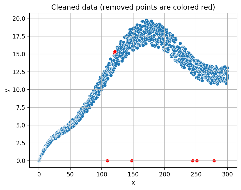
It is important to understand that identifying and removing outliers is essential. This helps ensure that the insights derived from the data are accurate and actionable, ultimately leading to better-informed decision-making within the organization.
This outlier removal and data clean-up are important because they prevent skewed results and misleading conclusions that can arise from inaccurate or irrelevant data points. Additionally, a clean and well-structured dataset allows for more efficient analysis, enabling organizations to make data-driven decisions with greater confidence and speed.
Fitting a curve (polynomial) into the data:
Now, we’ll discuss how our app fits an optimal polynomial into the data. To ensure clarity, we must first define what we mean by „optimal.“ In this context, optimal refers to minimizing the sum of the squared differences between the data points and the polynomial curve. By defining „optimal“ in this way, we can create a clear goal for our app’s algorithm to achieve.
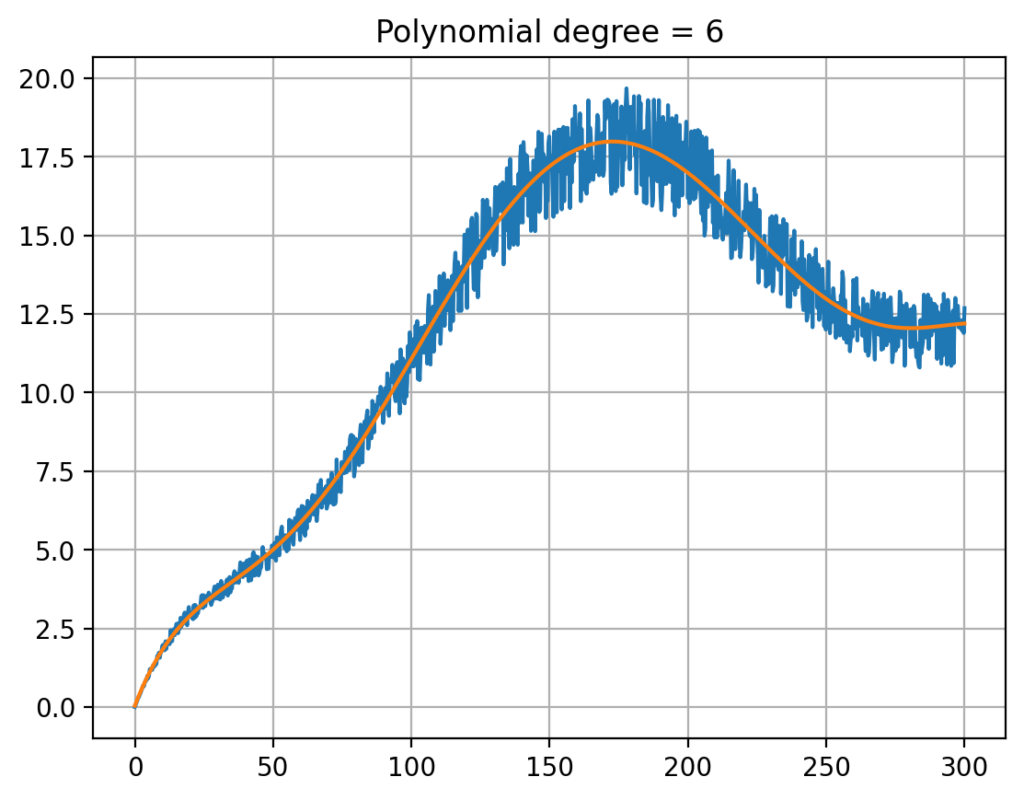
To simplify this concept for our readers, imagine that we are trying to draw a curve that best represents the overall trend of the data points. The optimal curve is the one that minimizes the total distance between itself and each data point, taking into account both the vertical and horizontal differences. By fitting this optimal polynomial curve to the data, our app can provide a more accurate and meaningful representation of the underlying relationship between the variables.

In summary, our app’s primary goal is to fit an optimal polynomial curve to the data, which we define as minimizing the sum of the squared differences between the data points and the curve. This approach ensures a more accurate representation of the data, ultimately leading to better insights and more informed decision-making.
Creating a user-interface (UI): In the final stage of our project, we developing a user-friendly interface that enables everyone in the lab to access and utilize the app through a web browser. This ensures that the powerful data science logic we’ve developed can be easily harnessed by non-experts, making the app a valuable tool for a wide range of users.

To achieve this end-to-end solution, we will deploy the app on a cloud service, such as Microsoft Azure or Amazon AWS. By hosting the app on a cloud platform, we ensure that it is accessible from anywhere with an internet connection, providing a seamless and convenient experience for users in the lab and beyond. This also allows for easy updates and maintenance, ensuring that the app remains up-to-date and reliable.
Here you can try the app yourself.
In conclusion, by combining our data science logic with a user-friendly interface and deploying it on a cloud service, we create a comprehensive end-to-end solution that can be easily accessed and utilized by everyone in the lab. This approach maximizes the impact of our data science project, empowering users to make data-driven decisions and improve their work processes.
Deploying the app
To make our app easily accessible and user-friendly, we take the app’s programming code and collaborate with a cloud provider, such as Azure or AWS. A cloud provider is a service that allows us to store and manage our app on their servers, making it available to users via the internet.
By using a cloud provider like Azure or AWS, we gain the benefits of reliability and uptime, meaning that our app will be consistently available and perform well for users. This is because these providers have vast resources and expertise in maintaining their servers and ensuring smooth operation.

Additionally, by using a cloud provider, we don’t need to invest in or maintain our own hardware, such as servers and storage devices. This saves us time, effort, and resources, allowing us to focus on improving the app and providing the best possible experience for our users.
Summary
This blog post has taken you through the journey of developing an end-to-end data science project that simplifies complex data analysis for non-experts, bridging the gap between technical experts and decision-makers in a company. We’ve discussed the importance of identifying and removing outliers from the data and the process of fitting an optimal polynomial curve to provide accurate insights. Furthermore, we’ve explained how the app’s user-friendly interface is developed and deployed on a cloud provider like Azure or AWS, ensuring reliability, uptime, and ease of access for users.
By combining powerful data science logic with an accessible interface and cloud deployment, this project aims to empower non-data scientists, such as lab technicans, to harness the power of data science in their decision-making processes. The end result is a comprehensive solution that makes data-driven insights readily available to a wide range of users, ultimately improving the efficiency and effectiveness of their work.